QR Code Colors: Design Scannable, Branded Codes
QR Code Colors: Design Scannable, Branded Codes
Yes, QR codes can be colored and remain fully scannable. The single rule that determines whether a colored code works or fails is contrast-first: the foreground modules must have strong luminance contrast against the background. Hue alone does not protect you. A bright red on white looks vivid on screen but can fail on older phones because red and white share similar luminance after grayscale conversion. The ISO/IEC 18004 standard that defines QR codes does not mandate black and white — it mandates that modules be distinguishable from their background. That distinction is entirely about luminance, not color. Rdyrct builds this principle into its branded QR code features, letting you apply brand colors while keeping codes reliably scannable.
Table of Contents
- Why designers and marketers color their QR codes
- How QR code color contrast actually affects scanning
- Practical dos and don’ts for QR code colors
- Gradients and decorative fills: what breaks and what can work
- How to add a logo or image at the center
- Step-by-step: how to change QR code colors safely
- File formats, CMYK, print substrates, and size rules
- Testing checklist and troubleshooting for colored QR codes
- Dynamic QR codes and error correction: what actually changes
- Expert preflight checklist before you publish or print
- Frequently asked questions
- Key Takeaways
- The case for restraint in colored QR design
- Rdyrct makes branded QR codes straightforward
- Useful sources and further reading
Why designers and marketers color their QR codes
Color turns a QR code from a generic black square into a brand asset. A code printed in your brand’s navy and cream reads as intentional design, not an afterthought. That matters on packaging, event signage, and business cards where every element competes for attention.
There are real, measurable reasons to use color beyond aesthetics:
- Brand recognition: A QR code in your brand palette reinforces identity at the moment of scan, especially on product labels and retail displays.
- Call-to-action clarity: A colored code placed inside a designed layout feels like part of the composition. A black square in the corner of a poster looks like a compliance sticker.
- Engagement on posters and campaigns: Color draws the eye to the code and signals that scanning it is intentional, not accidental.
- Product packaging: Matching the code to label colors avoids the visual clash that makes premium packaging look cheap.
That said, default black-on-white is still the right call in some situations. Small print runs under 1 inch, low-light environments like restaurant menus in dim lighting, and codes printed on uncoated kraft stock all benefit from maximum contrast. Color is a tool, not a requirement.
How QR code color contrast actually affects scanning
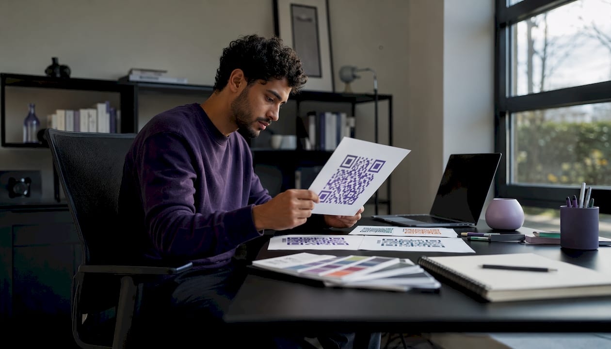
Most QR decoders do not see color the way your eyes do. The camera captures the image, the decoder converts it to grayscale, then applies a binarization threshold to classify each pixel as either light or dark. That two-step process means hue is irrelevant to the scanner. What matters is whether your foreground and background have different luminance values after that conversion.
Camera hardware compounds the problem. Auto-exposure, white balance, and sensor quality vary significantly across devices. A budget Android phone with a scratched lens and aggressive auto-exposure can flatten the apparent contrast between a dark teal module and a medium-gray background, even when the two look clearly distinct on your calibrated monitor. The same code scans fine on a flagship iPhone and fails on a three-year-old mid-range device.
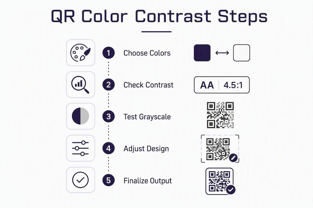
The grayscale conversion diagnostic is the fastest way to catch this before printing. Open your QR design in any image editor, desaturate it completely, and look at the result. If the modules and background look similar in tone, the scanner will struggle. A contrast ratio of roughly 4:1 is the practical floor for reliable scans across device types and lighting conditions, borrowed from WCAG accessibility thresholds. Anything below that is a gamble.
Pro Tip: Before exporting any colored QR code, duplicate the file, desaturate it in Photoshop or Figma, and check whether the modules are still clearly darker than the background. This takes 30 seconds and catches most failures before they reach print.
Practical dos and don’ts for QR code colors
The contrast-first rule translates into specific, testable choices. Here is what works and what reliably fails.
Safe combinations:
- Dark navy modules on a cream or white background
- Deep forest green on pale yellow or white
- Dark charcoal on light gray (test in grayscale first — this pair is borderline)
- Dark burgundy on white or very light pink
Combinations to avoid:
- Bright red on white (red desaturates to a mid-gray, not dark)
- Neon yellow, orange, or green on white (all collapse to near-white in grayscale)
- Light blue on white or pale backgrounds
- Any light-on-light pair, regardless of how different the hues look on screen
Inverted QR codes (light modules on a dark background) can work, but they fail more often than standard dark-on-light codes. Some older decoders are not designed to handle inversion. If you invert, test aggressively on budget devices before committing to print.
Accessibility note: Colorblind users are not the primary concern with QR codes since scanners read luminance, not hue. However, if your QR code is surrounded by instructional text or a call-to-action that relies on color to convey meaning (“scan the red code”), that text needs to be accessible. The code itself should pass the luminance test regardless.
Common failure patterns to watch for:
- Foreground color chosen by hue appeal without a grayscale check
- Background tinted to match brand color, reducing the luminance gap
- Gradient applied inside the module area (see the next section)
- Logo overlapping finder patterns in the corners
- Code printed on a warm-toned or textured substrate without contrast adjustment
Gradients and decorative fills: what breaks and what can work
Gradients inside the QR module area are one of the most common causes of scan failure in custom QR code designs. The problem is not the gradient itself — it is what it does to module edges. A gradient shifts luminance continuously across the code, which means some modules near the mid-point of the gradient will have insufficient contrast against their background. The binarization step cannot cleanly separate light from dark, and the decoder misreads or cannot read the pattern at all.
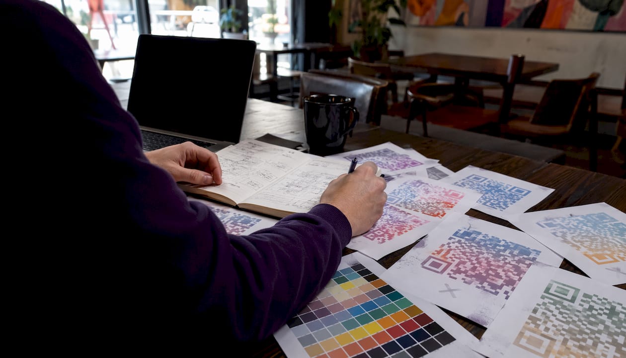
Photographic backgrounds placed behind the QR modules create the same problem. The texture introduces luminance variation that the decoder interprets as noise.
What can work instead:
A gradient frame placed outside the quiet zone is safe. The quiet zone (the clear border around the code) must remain unobstructed, but a decorative gradient border around that zone does not affect scanning at all. Similarly, a solid-color logo plate in the center is safer than a gradient fill across the whole code.
Per-finder-pattern coloring — applying a different color to the three square corner markers — can work at large sizes (poster scale, roughly 4 inches or larger) when each finder pattern color individually meets the 4:1 contrast threshold against its background. At small sizes, the margin for error disappears.
If you want a multi-color effect, the rule is that every individual module must meet the contrast threshold against the background at that specific location. A module sitting on a light section of a gradient background must still be dark enough relative to that local background value. Most gradient implementations do not guarantee this, which is why they fail.
How to add a logo or image at the center
A center logo is the most popular custom QR code design choice, and it is also the most likely to cause scan failures when done carelessly. The logo covers modules, and the decoder must reconstruct the missing data using error correction. That only works if the error correction level is set high enough and the logo does not exceed the safe coverage area.
Error correction levels run from L (roughly 7% data recovery) through M (15%), Q (25%), and H (approximately 30% data recovery). For any design experiment involving a logo, use level H. It generates a slightly denser code but gives you the most headroom.
With H-level error correction, a logo covering up to about 30% of the code area is the practical maximum. Most practitioners keep logo coverage moderate to ensure margin for real-world scanning conditions. Beyond a certain coverage threshold, even H-level correction cannot reliably reconstruct the missing data.
A white logo plate (a white rectangle or circle behind the logo, with roughly 5–8 pixels of padding around the logo edges) helps the decoder by creating a clean boundary between the logo area and the surrounding modules. Avoid thin-line logos or logos with transparent backgrounds placed directly over modules — the visual bleed confuses the decoder.
One absolute rule: the logo must never overlap the three finder patterns in the corners or encroach on the quiet zone. Those elements are how the decoder orients itself. Cover them and the code will not scan regardless of error correction level.
Step-by-step: how to change QR code colors safely
- Generate the base code in black and white at your final intended size. Confirm it scans on at least two devices before touching color. This establishes a working baseline.
- Change the foreground (module) color first, not the background. Tinting the modules is lower risk than tinting the background because you are darkening toward a light base. Most generators label this “foreground color” or “dot color” in the color tab. In tools like Canva’s QR generator, this is the primary color picker.
- Check the contrast ratio. Use a contrast checker (WebAIM’s contrast checker works for this purpose) by entering your foreground and background colors. Aim for at least 4:1. If you are below that, darken the foreground or lighten the background.
- Run the grayscale diagnostic. Export a PNG, desaturate it in any image editor, and confirm the modules are clearly darker than the background. If they look similar in tone, the color choice will fail on real devices.
- Add your logo plate if needed. Place it at the center, keep it within 20–25% of the total code area, and use H-level error correction. Add a white plate with 5–8 px padding behind the logo.
- Export in the correct format. For print, export as SVG or PDF to preserve sharp module edges at any scale. For digital use (websites, email, social), export as PNG at a minimum of 300×300 pixels. Save your exact brand color values — RGB hex for screen use, CMYK percentages for print.
Most generator UIs, including the color tab in QRCodeChimp and similar tools, follow this same flow: open color settings, pick foreground, pick background, adjust rounded corners if desired, then export.
File formats, CMYK, print substrates, and size rules
| Format | Best for | Key export setting |
|---|---|---|
| SVG | Print, large-format, any scalable use | Keep paths clean; no embedded raster |
| Press-ready print, packaging | CMYK color profile, embed fonts | |
| PNG | Web, email, digital screens | 300 px minimum |
| JPEG | Avoid for QR codes | Compression artifacts blur module edges |
SVG and PDF are the right choice for anything going to a printer. Vector formats scale without degradation, so a code that looks sharp at business-card size also looks sharp at poster size. PNG is fine for screens but loses quality when scaled up, and JPEG compression creates artifacts at module edges that can cause scan failures.
CMYK conversion matters. RGB colors do not map directly to CMYK, and some vivid RGB colors (especially electric blues and bright greens) shift noticeably when converted. Always convert your color values to CMYK before sending files to a printer and request a physical proof. The printed CMYK version of your brand color may have lower luminance contrast than the RGB version looked on screen.
Substrate effects are significant. Kraft paper, textured stock, and uncoated paper all absorb ink differently and reduce perceived contrast. Varnish and gloss finishes create reflective hotspots that can wash out modules under direct light. Foil stamping almost always fails for QR codes because the reflective surface confuses camera auto-exposure.
Size and quiet zone rules:
- Minimum quiet zone: a clear border of modules wide on all sides (the clear border around the code)
- Minimum physical size for reliable scanning: approximately 1 inch × 1 inch for standard use
- For textured or warm-toned substrates, increase module size by 25–50% or print the code on a white sticker or panel applied to the substrate
Testing checklist and troubleshooting for colored QR codes
- Grayscale test. Desaturate your design file and confirm modules are clearly darker than the background. Do this before any other test.
- Contrast ratio check. Verify at least 4:1 foreground-to-background contrast using a WCAG-style checker.
- Test on four real devices. Use an iPhone (recent model), an Android flagship, an older or budget Android (two to three years old), and a device with a scratched or smudged lens. If it fails on the budget device, it will fail in the field.
- Test in two lighting conditions. Scan under bright overhead light and in dim ambient light. Dim light is where marginal contrast choices fail first.
- Test a printed sample from the actual press run. Digital proofs and printer proofs can both look fine while the production run drifts due to color separation variation. Always test a physical sample from the actual print batch.
Troubleshooting quick fixes:
- Fails on older or budget phones: Darken the foreground color or increase the physical module size. A contrast ratio just above 4:1 may not be enough for low-quality sensors.
- Fails when inverted (light on dark): Revert to dark modules on a light background. Some decoders handle inversion poorly.
- Fails on kraft or textured stock: Print the code on a white sticker or panel, then apply it to the substrate. Alternatively, increase module size by 25–50%.
- Fails after adding a logo: Reduce logo size to under 20% of the code area, add a white plate behind it, and confirm error correction is set to H.
- Fails in dim light: Increase contrast ratio beyond 4:1, targeting 7:1 or higher for environments where ambient light is consistently low.
Dynamic QR codes and error correction: what actually changes
Dynamic QR codes redirect through a short URL, which means you can change the destination without reprinting the code. That is genuinely useful for campaigns. What dynamic codes do not change is the scanning mechanics. The decoder still reads the same pattern of dark and light modules, and all the contrast and substrate rules apply identically.
The practical advantage of dynamic codes for design experiments is that you can test a colored version in the field, track scan performance through analytics, and update the destination if the campaign changes — all without reprinting. Rdyrct’s branded QR codes work this way: the short link embedded in the code is editable, while the printed asset stays the same.
Error correction level H is worth using for any design that includes a logo or decorative elements. It generates a denser code with more modules, which means the code needs to be slightly larger to remain scannable at the same physical size. The trade-off is worth it: H-level correction recovers up to approximately 30% of damaged or obscured data, giving you real headroom for logos and minor print imperfections. Higher correction does not fix low contrast or blurred module edges — those are separate problems that only better color choices and sharper print quality can solve.
Expert preflight checklist before you publish or print
Before any colored QR code goes to press or live deployment, run through these checks:
- Grayscale diagnostic: desaturate the design and confirm clear module-to-background separation
- Contrast ratio: verify at least 4:1; target 7:1 for low-light or small-print applications
- Quiet zone: confirm 4 modules of clear space on all four sides, unobstructed by design elements
- Logo coverage: confirm the logo covers no more than 20–25% of the code area and does not touch the finder patterns
- Error correction: confirm H-level is set for any design with a logo or decorative elements
- Physical print sample: test a sample from the actual press run, not just the digital proof
- Multi-device scan test: test on at least four devices including a budget Android
- Substrate check: if printing on textured or warm-toned stock, test on the actual material
Pitfall callouts for print runs:
- Color separation drift across a long press run can push a marginal color choice past the failure threshold. A code that passes on the first 500 copies may fail on copy 2,000 if ink density shifts.
- Varnish highlights on gloss finishes create reflective spots that wash out modules under direct light.
- Per-finder-pattern color (different colors on the three corner squares) looks striking but fails at small sizes when the finder pattern color does not individually meet the contrast threshold.
Pro Tip: When printing on textured materials like linen-finish business cards or kraft packaging, increase your module size by 25–50% compared to what you would use on smooth coated stock. The texture absorbs ink unevenly and compresses effective contrast. A white logo plate behind any center image also helps the decoder find the boundary between the logo and the surrounding modules.
Frequently asked questions
What color should a QR code be? The foreground (modules) should be dark and the background light, with at least a 4:1 luminance contrast ratio. Dark navy, deep green, or charcoal on white or cream are reliable choices. Run a grayscale test to confirm before printing.
Can a QR code be any color? Technically yes, but practically no. Any color pair that maintains strong luminance contrast after grayscale conversion will scan reliably. Colors that look different on screen but share similar luminance values — like bright red and white, or neon yellow and white — will fail on real devices.
How do you change the color of a QR code? Open your QR generator’s color settings, change the foreground (module) color first, then optionally adjust the background. Check the contrast ratio, run the grayscale diagnostic, and export as SVG or PDF for print or PNG for digital use.
Are colored QR codes effective? Yes, when contrast rules are followed. Colored QR codes that match brand colors increase perceived design quality and can improve scan rates by making the code feel like an intentional design element rather than a compliance marker. The key is testing on real devices before deployment.
Why does my colored QR code fail to scan? The most common cause is insufficient luminance contrast between the modules and the background. Convert the design to grayscale — if the modules and background look similar in tone, that is the problem. Other causes include a logo that is too large, a gradient inside the module area, or a substrate that compresses contrast.
Key Takeaways
Colored QR codes scan reliably when luminance contrast between modules and background meets at least a 4:1 ratio — every other design choice is secondary to that single rule.
| Point | Details |
|---|---|
| Contrast-first rule | Maintain at least 4:1 luminance contrast; verify with a grayscale conversion before exporting. |
| Foreground over background | Tint the modules (foreground) rather than the background to preserve the luminance gap. |
| Vector for print | Export as SVG or PDF for any print use; PNG at 300 px minimum for digital. |
| Test on real devices | Scan on at least four devices including a budget Android and in dim lighting before any print run. |
| Rdyrct for branded codes | Rdyrct’s branded QR codes support custom colors with privacy-friendly analytics, available on free and paid tiers. |
The case for restraint in colored QR design
Color customization in QR codes is genuinely useful, and the instinct to match brand colors is correct. Where designers consistently go wrong is treating the QR code as a canvas rather than a functional element. The most common failure I see is a beautiful gradient or a perfectly on-brand pastel palette that looks stunning in the mockup and fails on half the phones at the event.
The honest design principle here is that the code’s job is to be scanned by the widest possible range of devices, in the widest possible range of conditions, by people who are not thinking about contrast ratios. That means the luminance contrast needs to be generous, not just technically sufficient. A 4:1 ratio is the floor, not the target. Aim for 7:1 when the use case involves any uncertainty about lighting or device quality. Brand expression is worth pursuing, but a code that fails to scan is worse than a plain black square — it actively damages the experience you were trying to create.
Rdyrct makes branded QR codes straightforward
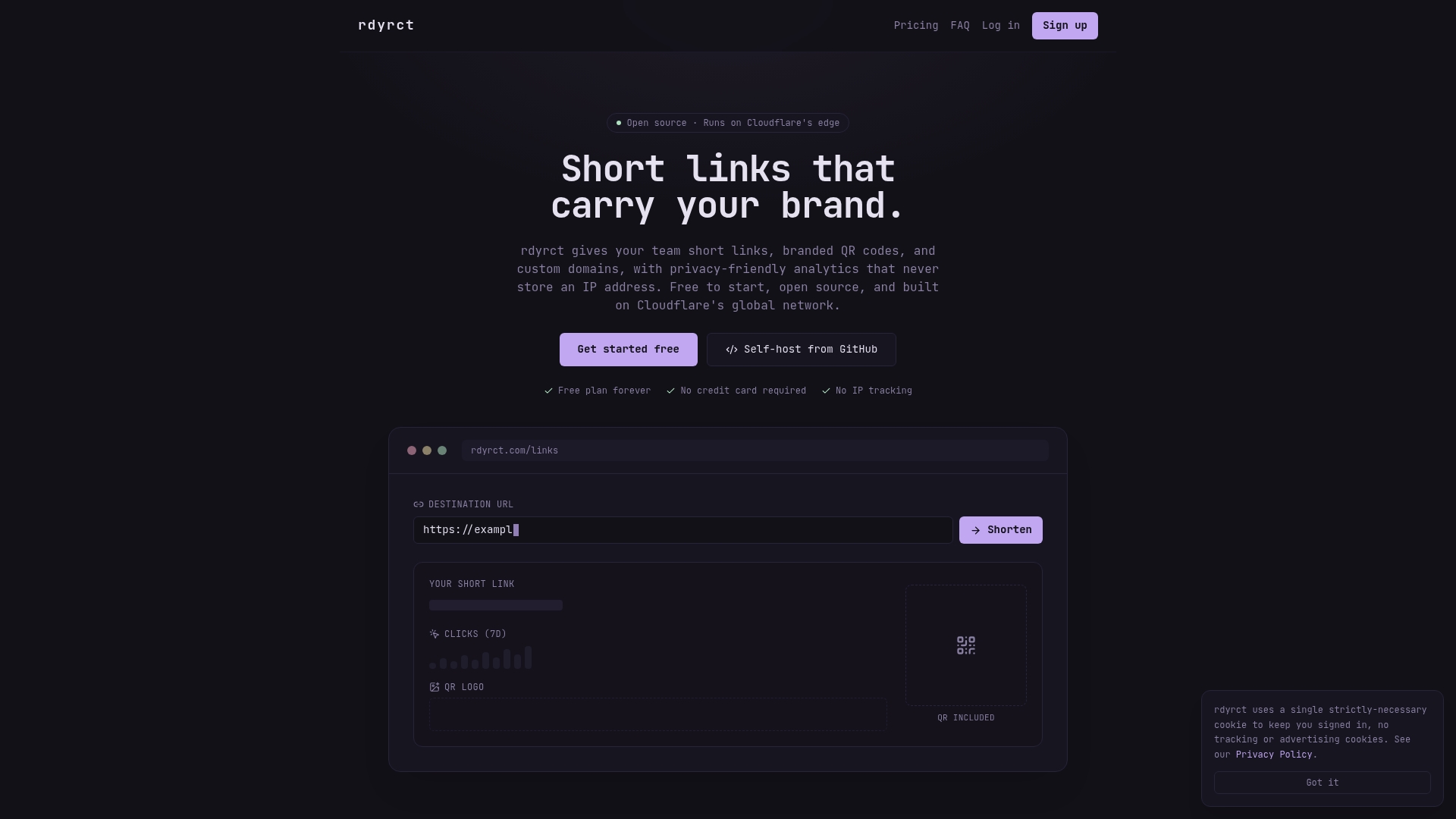
If you are building campaigns that need colored, branded QR codes alongside trackable short links, Rdyrct is built for exactly that workflow. The platform generates branded QR codes tied to short links you control, with privacy-focused analytics that track country, referrer, and device without storing IP addresses.
Key features relevant to QR color workflows:
- Branded QR codes with custom color options, tied to editable short links
- Privacy-friendly analytics covering referrer, device, and country data without invasive tracking
- Dynamic links that let you update the destination without reprinting the QR code
- Free forever plan for getting started, with paid tiers unlocking branded assets, custom domains, and extended analytics history
For designers and marketers who need campaign-grade QR assets without compromising on privacy, Rdyrct’s branded QR features are worth a look. Start with the free plan and upgrade when your campaign volume demands it.
Useful sources and further reading
For designers and print specialists who want to go deeper on the technical and practical side of colored QR codes:
- QR Code Design Best Practices | Fast QR — Covers quiet zone rules, contrast guidance, and the case for starting with black-on-white before applying brand color.
- Colored QR Codes: Brand Colors Without Breaking Scans | Fast QR — Practical contrast ratio guidance and color separation notes for press runs.
- Can You Change QR Code Colors? | Qraft — Technical explanation of grayscale conversion and luminance-first design.
- Coloured QR Code Generator | GridStripe — Generator with explicit error-correction settings; useful for testing H-level correction with logos.
- How Printing Techniques Impact QR Code Scannability | Pageloot — Substrate effects, varnish, foil, and module-size recommendations for textured materials.
- QR Code Background Color Guide | QRCodeChimp — Step-by-step UI walkthrough for changing foreground and background colors in a generator.
- QR Code — Wikipedia — ISO/IEC 18004 standard overview and technical structure of QR codes.
Follow the testing checklist in this article before any print run, and always request a physical sample from the actual press batch before approving a full production run.