Marketers: Decision First Link Analytics Dashboards Without IP Storage
Marketers: Decision First Link Analytics Dashboards Without IP Storage

A link analytics dashboard tracks every click on a shortened or tagged URL and turns that raw activity into clicks, sources, and device data you can act on. Marketers and analysts use one to measure campaign reach, attribute traffic to the right channel, and spot underperforming links before budget gets wasted. Privacy-friendly versions now exist that skip IP storage without losing the detail you need, and those are covered later.
TL;DR:
- A credible link analytics dashboard should display referrer, device, and geography data without storing IP addresses to maintain user privacy.
- Using consistent UTM naming conventions and branded short links ensures accurate campaign attribution and reduces data fragmentation.
- Layout design should prioritize decision-making, with clear hierarchy, preattentive encoding, and reversible drilldowns to support quick insights.
- Offline tracking with QR codes feeding into the same dashboard requires generating short, branded links and establishing proper setup procedures.
- Selecting a tool involves checking metric completeness, data latency, privacy practices, and integration options through a focused evaluation process.
Table of Contents
- What metrics should a link analytics dashboard show?
- How dashboard design turns data into decisions
- How to set up tracked links and QR codes correctly
- Getting link data into the rest of your stack
- Privacy-first analytics without losing useful detail
- How to choose the right dashboard for your team
- What I’ve learned building privacy-first link dashboards
- Try rdyrct for privacy-first links, QR codes, and analytics
- Sources
- FAQ
What metrics should a link analytics dashboard show?
A credible dashboard goes past a raw click counter. You need enough dimensions to answer “which channel worked” and “where did people drop off,” not just “how many people clicked.”
At minimum, expect these categories:
- Clicks and unique clicks: total clicks show volume, unique clicks show reach, and the gap between them reveals repeat engagement or bot traffic.
- Click-through rate and trend lines: a time series matters more than a single number because it shows whether a campaign is accelerating or fading.
- Referrer, channel, and UTM breakdowns: these tell you which source drove the click, though dark social (traffic from messaging apps and private shares) often shows up as “direct” with no referrer at all.
- Geography, device, and browser: useful for targeting, but treat low-sample countries or device types cautiously since a handful of clicks can look like a trend that isn’t real.
- Funnel events and attribution windows: if the link feeds a signup or purchase, the dashboard should show how many clicks converted within a defined window, not just that a conversion happened eventually.
Cohort views, grouping clicks by campaign launch date or audience segment, help you compare like with like instead of averaging unrelated traffic together.
How dashboard design turns data into decisions
Most dashboard failures are not data problems, they are layout problems. A systematic review of 144 dashboards identified 42 recurring design patterns, and the ones that matter most for link analytics are drilldown, parameterization, and clear navigation between summary and detail views.
The strongest layouts follow a decision-first rule: every view exists to answer one question. A campaign overview should let you decide whether to keep spending, not force you to reconcile five competing charts. Nielsen Norman Group’s research on preattentive processing recommends encoding comparisons with position and length (bar charts, aligned axes) rather than area or angle, since those are the attributes people perceive almost instantly. Pie charts, by contrast, ask the eye to do work it isn’t built for.
Filter visibility matters just as much as chart choice. Primary filters like date range and campaign belong in a fixed top bar; advanced segmentation can sit behind a drawer. Active filters should always be visible so you don’t misread filtered data as the full picture.
Pro Tip: If a view needs more than one primary chart to answer its core question, split it into two views instead of cramming both in.
Good drilldowns are reversible. You should be able to click into a single link’s detail and get back to the campaign summary in one step, not rebuild your filters from scratch.
- Metric hierarchy: put the one number that matters most in a large, isolated card, not buried in a row of equal-sized tiles.
- Preattentive encoding: use bar length and aligned position for comparisons, and avoid 3D effects or heavy borders that add visual noise without adding information.
How to set up tracked links and QR codes correctly
Implementation determines whether your dashboard has clean data to show. Follow these steps in order:
- Set UTM governance first. Agree on a naming convention (lowercase, consistent separators, a fixed list of source and medium values) before anyone creates a link, so campaigns roll up correctly instead of fragmenting into near-duplicate rows.
- Use branded short links for anything shared publicly. They’re easier to type, easier to trust, and every click routes through your analytics automatically.
- Generate QR codes for offline or print placements. A QR code pointed at a tracked short link feeds the same dashboard as a digital click, so packaging, posters, and business cards become measurable.
- Choose your conversion capture method deliberately. Server-side webhooks are more reliable than client-side pixels because they aren’t affected by ad blockers or browser privacy settings, though they take more setup work.
- Run a small-sample QA pass before launch. Click your own links from different devices and networks, then check that the dashboard logs the expected referrer, device, and country before the campaign goes live at scale.
Consistent naming across steps one and two is what makes step five actually catch errors instead of just confirming clicks arrived.
Getting link data into the rest of your stack
A dashboard is only useful if the data can leave it. Most tools support a mix of formats depending on how fast you need the data and how it needs to be joined with other systems.
- CSV and JSON exports work for one-off reporting or feeding a spreadsheet model.
- BI connectors to warehouses like BigQuery or Snowflake let analysts join click data with sales or product data for full-funnel attribution.
- Webhooks and live feeds push events in near real time, which matters for time-sensitive campaigns like flash sales.
- Scheduled batch exports are fine for weekly or monthly reporting where a few hours of lag doesn’t matter.
Whichever method you use, preserve the link identifier and its UTM parameters through every export. Losing that context is how a report ends up with clicks that can’t be traced back to a specific campaign. Also check retention windows and whether the source data is sampled, since a dashboard that quietly samples high-volume links can understate real traffic.
Privacy-first analytics without losing useful detail
Privacy-first dashboards can still report country, referrer, and device without storing IP addresses, typically by aggregating signals or using short-lived, hashed identifiers instead of persistent tracking. One approach to country-level click analytics without storing IPs shows how this works in practice: location is derived and discarded rather than logged against an individual.

The tradeoff is granularity. Cookieless attribution often relies on cohorting or delayed attribution windows, which means you lose the ability to trace one specific click through a multi-step funnel with certainty. You can offset this by widening your analysis window, relying on aggregated cohorts instead of individual sessions, and accepting a slightly fuzzier picture in exchange for not holding data you don’t need.
A short checklist before you go live:
- Confirm retention settings match your reporting needs, not just the vendor default.
- Check for consent flags if your dashboard integrates with a consent management platform.
- Review what exports include so a CSV pull doesn’t accidentally carry more detail than your privacy policy allows.
How to choose the right dashboard for your team
Run this as a 30-minute evaluation before committing to a tool:
- Check metric coverage first. Confirm clicks, referrer, device, and geography are all present, not just a subset dressed up with charts.
- Test latency. Click a test link and time how long it takes to appear in the dashboard, since same-day campaigns need near real-time data.
- Verify integrations. Confirm API access and at least one export format that matches your existing reporting stack.
- Assess privacy posture. Ask directly whether IP addresses are stored and for how long.
- Check team fit. Look for role-based views, so an analyst and a campaign manager aren’t both wading through the same raw feed.
- Confirm the cost model. Understand what triggers an upgrade, click volume, link count, or team seats, before you scale usage.
What I’ve learned building privacy-first link dashboards
The hardest part of link analytics isn’t collecting data; it’s resisting the urge to collect more than you need. Every extra field you store is a liability if it isn’t tied to a real decision. A well-built KPI card shows clicks, referrer, and device at a glance, with country and campaign one click away, and nothing that requires storing a person’s IP address to work.
If you’re building or choosing a dashboard, start with the decision it needs to support, then add fields. Everything else is noise.
— Andrea
Try rdyrct for privacy-first links, QR codes, and analytics
rdyrct covers the checklist above directly: branded short links, a UTM builder for consistent campaign tagging, and QR code generation, all feeding one dashboard that shows referrer, device, and country without storing IP addresses.
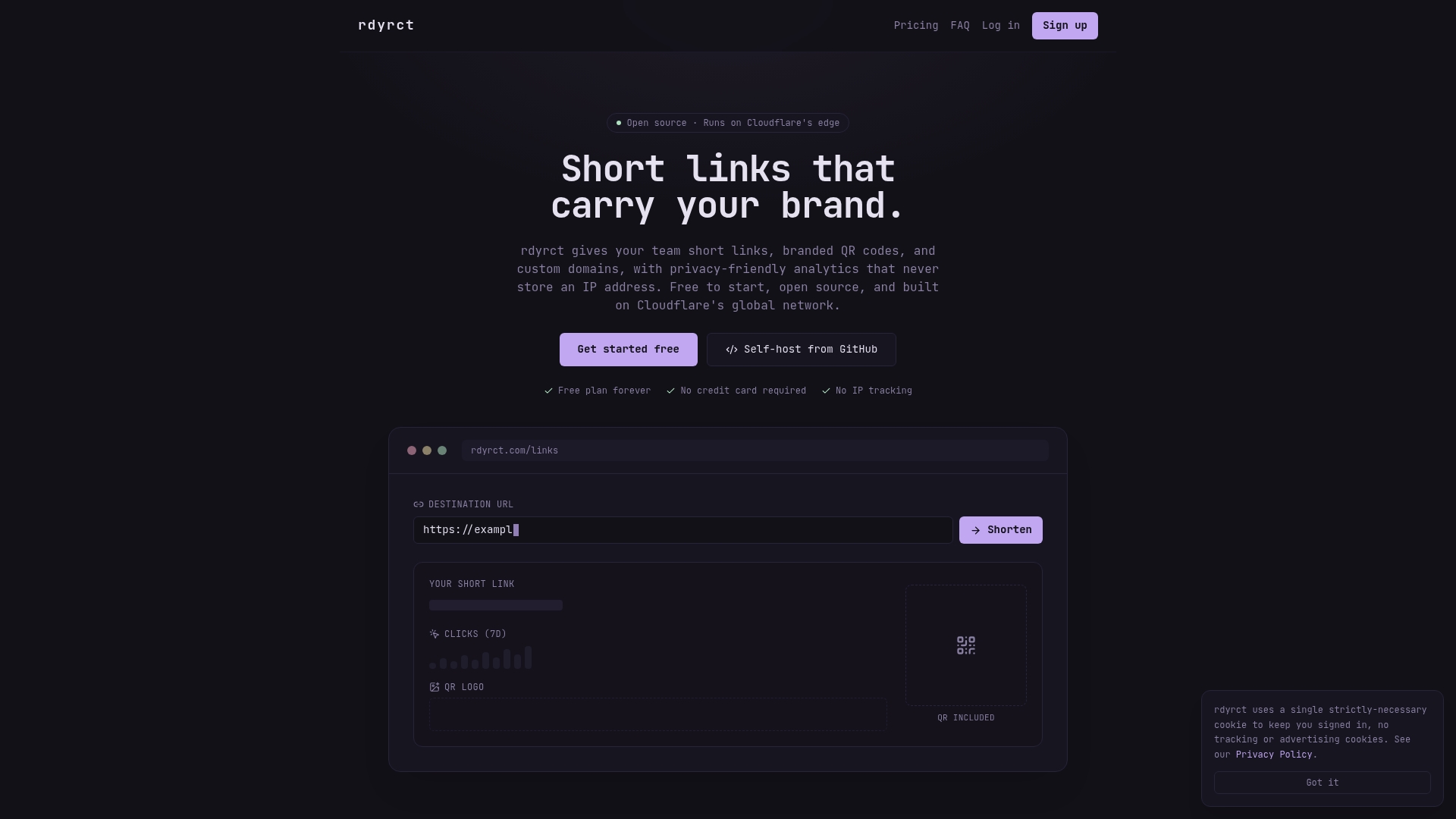
Start on the Free plan and create a tracked link through the short link and UTM builder, then check the dashboard for referrer and device data within a few clicks. If you need offline tracking, the QR code generator plugs into the same analytics without extra setup. Higher subscription levels can unlock additional features, including custom domains and extended analytics history.
Sources
- Dashboards: Making charts and graphs easier to understand - Nielsen Norman Group
- Dashboard design patterns — systematic review (arXiv)
- Cognitive abilities and visual complexity impact five-second testing (2024)
FAQ
What is an analytics dashboard?
An analytics dashboard is a visual interface that pulls raw data, in this case link clicks, into charts and summary metrics so you can spot trends without querying a database. A good one follows decision-first design principles so the most important number is visible first.
What is a dashboard link?
A dashboard link, in the context of link analytics, refers to a tracked short URL or QR code whose clicks feed directly into a dashboard view. Each link carries identifying data like its UTM parameters so its performance can be isolated from other campaigns.
What is the five second rule for dashboards?
The idea that users form a usable impression of a dashboard within five seconds comes from broader usability testing, but research on cognitive load and visual complexity shows this varies by how complex the layout is. A cluttered dashboard needs longer than five seconds to be understood, which is itself a design failure worth fixing.
How do I view my dashboard?
Most link analytics platforms show your dashboard immediately after login, organized by link, campaign, or date range depending on the tool. On rdyrct, clicking any short link created through the short link and UTM builder opens its analytics view directly.
How do I choose between competing link analytics tools?
Compare metric coverage, data latency, integration options, and privacy posture side by side, and run a small test link through each before committing. The 30-minute evaluation checklist above covers the specific checks worth running during a trial.